
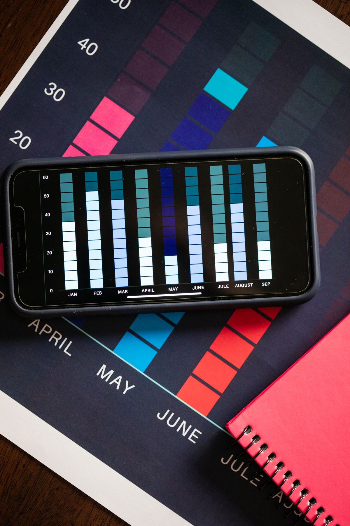
A table of revenue figures by date can be very precise – and still say little as long as nobody finds the time to analyse it line by line. Patterns such as "we hardly sell anything on Friday afternoons" or "there is a sales boost every March" often stay hidden in plain columns of figures. 1Tool offers a heatmap analysis of invoice data that makes such patterns visible at a glance.
Why a heatmap shows more than a table
A heatmap translates figures into colour intensity: periods with high revenue stand out clearly, while weaker periods recede visually. This lets you grasp patterns across weekdays or time periods without having to compare individual values – the human eye picks up differences in colour faster than differences between numbers in a table. Seasonal peaks or recurring weak phases that show up over months or years in particular are immediately obvious in a heatmap, whereas they easily get lost in a classic list.
Filterable, with saved settings
The heatmap view in 1Tool can be filtered, so the analysis can be narrowed down to specific periods or criteria. Once selected, filter settings are saved, so they do not have to be set again the next time you open the view. This also makes the analysis practical for recurring use, for example when you regularly want to look at the current distribution of sales.
Practical benefits for planning and timing
If you know on which weekdays or in which periods revenue is typically highest, you can align staff planning accordingly – for example scheduling more capacity on strong days instead of spreading it evenly across the week. Likewise, the timing of marketing activities or promotions can be adapted to sales patterns you have actually observed rather than relying on assumptions. Over a longer period, the heatmap also shows whether seasonal effects repeat themselves, which in turn can feed into planning for the coming year.
Frequently asked questions
What exactly is the revenue heatmap in 1Tool based on?
The heatmap analyses the existing invoice data and presents it visually to reveal periods with particularly high or low revenue.
Can I narrow the view down to specific periods?
Yes, the heatmap view can be filtered, so you can narrow it down to the periods that are relevant to you.
Do I have to set my filters again every time I open the view?
No, selected filter settings are saved and are available again the next time you open the view.
Would you like to see when your business really sells the most?